Mastering Reusability in tailwind: Getting started with Class Variance Authority in React.js
Build Consistent and Reusable UI with Class Variance Authority (CVA)

Student at VIT pursuing B.Tech in AI and Robotics. Loves to explore new technology and management strategies.
Hello, geeks! In this article, we'll delve into the realm of creating reusable components in React.js using Class Variance Authority (CVA). We'll explore the benefits, best practices for larger projects, and how to get started with this innovative approach to component design.
What is Class Variance Authority (CVA)?
Class Variance Authority is a concept that enables the creation of versatile and reusable components by managing variants of a base set of classes. It allows developers to handle different visual states or styles within a single component, offering a cleaner and more maintainable solution than hard-coded conditional styling.
Let's dive into the practical implementation:
Setting up the Development Environment:
npx create-react-app my-cva-app
cd my-cva-app
Now, Set up tailwind in your project by following the set of steps provided here.
Adding dependencies:
yarn add class-variance-authority tailwind-merge
Creating a Reusable Button:
Create a new button.jsx file under components folder:
// src/components/Button.jsx
import React from "react";
import { cva, VariantProps } from "class-variance-authority";
import { twMerge } from "tailwind-merge";

const buttonStyles = cva(
  ["flex", "items-center", "justify-center", "transition-colors", "text-white"],
  {
    variants: {
      variant: {
        primary: ["bg-blue-500", "hover:bg-blue-700"],
        secondary: ["bg-green-500", "hover:bg-green-700"],
        tertiary: ["bg-orange-500", "hover:bg-orange-700"],
      },
      size: {
        default: ["rounded", "w-20", "h-20", "p-2"],
        button: ["rounded", "h-10", "w-32"],
        icon: ["rounded-full", "w-20", "h-20", "p-2.5"],
      },
    },
    defaultVariants: {
      variant: "primary",
      size: "default",
    },
  }
);

// type ButtonProps = VariantProps<typeof buttonStyles> &
//   React.ComponentProps<"button">;
// use this type for .tsx files

const Button = ({ variant, size, className, ...props }) => {
  return (
    <button
      {...props}
      className={twMerge(buttonStyles({ variant, size }), className)}
    />
  );
};

export default Button;
In the Button component, we dive into the world of Class Variance Authority (CVA) to craft a dynamic and reusable button with varied styling options. Leveraging the cva function from class-variance-authority, we define a foundational set of classes, introducing variants for both variant and size to accommodate diverse design needs. This configuration is encapsulated in the buttonStyles constant. The Button component, being a functional component in React, gracefully accepts props like variant, size, className, and standard button element properties. To seamlessly blend CVA styles with external ones, we enlist the aid of twMerge from tailwind-merge. This enables a fluid merging of styles, ensuring that the button remains highly adaptable and consistent across different implementations.
Next, we will update app.jsx to see the changes:
// src/App.js
import React from "react";
import Button from "./components/button";
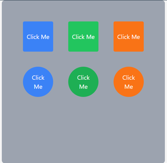
const App = () => {
return (
<div className="flex items-center justify-center bg-neutral-100">
<div className="grid grid-cols-3 grid-rows-3 gap-10 bg-gray-400 p-14 rounded-lg">
<Button variant="primary">Click Me</Button>
<Button variant="secondary">Click Me</Button>
<Button variant="tertiary">Click Me</Button>
<Button variant="primary" size="icon">
Click Me
</Button>
<Button variant="secondary" size="icon">
Click Me
</Button>
<Button variant="tertiary" size="icon">
Click Me
</Button>
</div>
</div>
);
};
export default App;
output:
Best Practices for Larger Projects:
Group variants logically within the CVA configuration, making it easy to find and manage them as your project scales.
Document the available variants, their intended use cases, and any considerations for developers working on the project.
Incorporate code reviews to ensure consistency in how variants are utilized across components.
In large-scale applications, be mindful of the potential impact on performance due to the increased number of classes.
Conclusion
Congratulations! We successfully integrated CVA in our tailwind project. Class Variance Authority empowers developers to create highly reusable and adaptable components. While it comes with its set of thinking challenges, the benefits in terms of reusability, consistency, and maintainability make it a compelling approach for modern web development. As your projects grow, thoughtful organization, documentation, and adherence to best practices will contribute to a robust and scalable design system. Understanding the role of twMerge adds a layer of clarity when integrating CVA with external styles, making the development process smoother.

